UNDERSTANDING COLOUR | MARGARET FARRELL
Dates: 21st & 22nd mar 2026
Times: 10am - 4pm
Location: Enniskerry
Skill Level: all levels welcome
Please see detailed workshop information below
If this course is fully booked or not currently scheduled, go ahead add your name to the waiting list HERE
Payment plans available contact us directly
aBOUT THE WORKSHOP
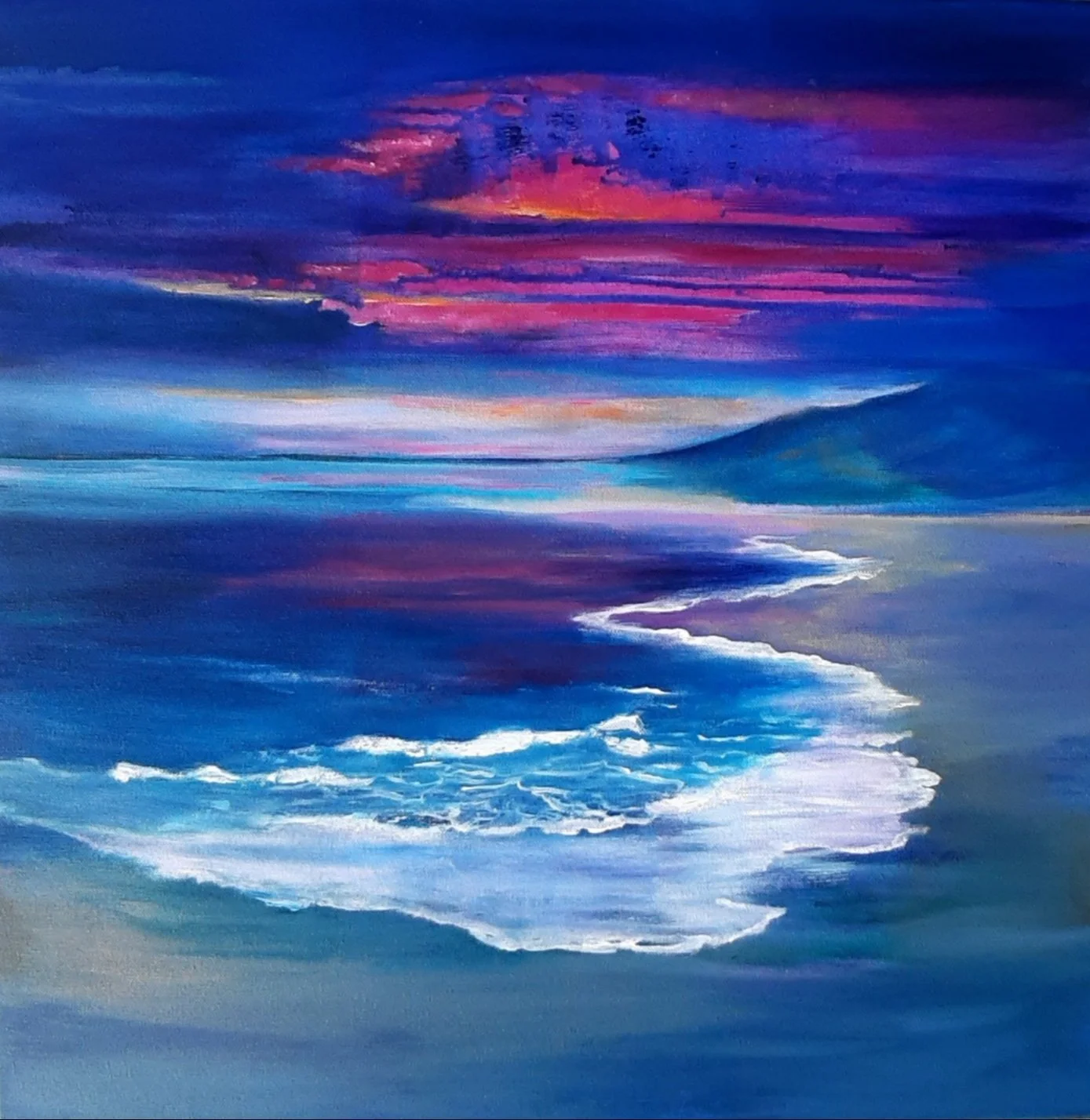
This “Understanding Colour" workshop focuses on empowering you to use colour confidently and expressively in your artwork. Through a combination of theory, hands on exercises and intuitive exploration, this course will help you understand the principles of colour design, colour relationships, and how to effectively utilise colour choices to achieve desired emotional effects. Whether you are an experienced artist looking to delve deeper into colour theory or a beginner eager to explore, this workshop offers a fun and supportive environment to learn and experiment with colour. While we will be using acrylic for this workshop, the principles of colour we discover can be applied to any medium.
-
What You’ll Learn
1. Introduction to Expressive Colour
Understand how personal and subjective colour preferences shape your work.
Explore your own emotional responses and associations with colour.
2. Principles of Colour Design
Learn the fundamentals of hue, tint, and tone.
Use colour harmony to create serenity and balance in your compositions.
Apply contrast to generate excitement, tension, and visual interest.
Incorporate repetition and pattern to enhance colour dynamics.
3. Creating Emotional Effects
Harness colour to convey specific emotions, from joy to drama.
Select colour palettes that set a mood and atmosphere.
Understand the impact of muddy colours and how to avoid them.
Balance pure and bright colours to increase vibrancy and energy.
4. Understanding Colour Placement
Guide the viewer’s eye with strategic use of intense colours.
Create harmony and serenity through thoughtful colour arrangements.
Explore contrast, gradation, and balance to suggest movement or stability.
5. Exploring Colour Theory Intuitively
Discover intuitive methods to select colour palettes that resonate with you.
Experiment with colour harmony, contrast, rhythm, repetition, gradation, balance, and dominance.
-
Pad of watercolour paper
I recommend A4 size , about 200gsm weight and a pad of about 50 to 70 sheets . We will use lots of paper as we experiment so please make sure to bring enough. If you have other size paper pads bring them along as well. Paper needs to be able to take acrylic paint so sketchbooks are not advisedTempered glass kitchen chopping board for use as a palette. Must be smooth surface for ease of cleaning. Available from most household stores eg Dunnes, Homestore and More etc
Paint scraper (available from most hardware stores)
Selection of different shaped palette knives (2 or 3)
A Colour Wheel
A Selection of acrylic paints 60ml tubes
Bring what you have especially any favourite colours you have. The choice of colours is very personal and it is not necessary to have all of these. These colours are my personal favourites:
Process Cyan or Cerulean Blue
Ultramarine or indigo
Turquoise
Purple
Raw Umber
Pthalo Green
Process Magenta
Lemon Yellow
Crimson Red or Permanent Alizarin
Cadmium Orange
Titanium White (2 x 60ml tubes because we will use a lot of white!)
Brushes : Large (3 inch flat), medium (1.5 inch flat) and small brushes and some old scraggy brushes with lots of character
Cotton buds and Kitchen Roll
Water sprayer (an old windolene spray bottle or plant sprayer filled with water will do fine)
Masking tape
An old toothbrush
Disposable gloves
Bathroom sponge (cheap one for cutting up)


“Every portrait that is painted with feeling is a portrait of the artist, not of the sitter.”
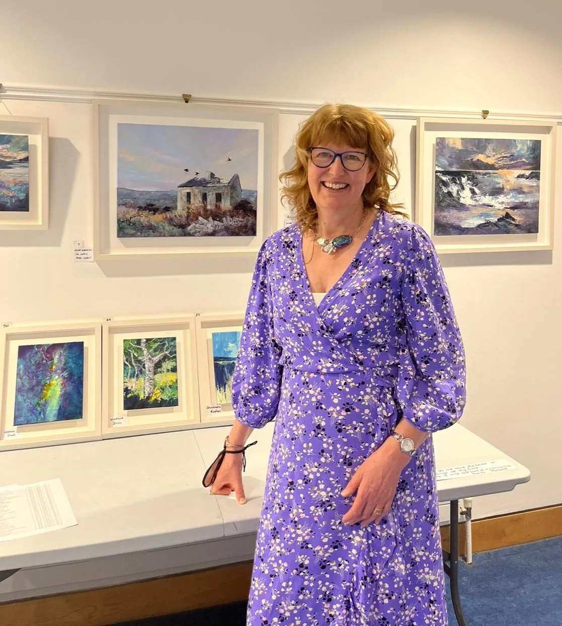
MEET THE ARTIST